Voici 10 diagrammes qui illustrent les récents avancements de l’humanité. Il y a de l’espoir, même si on pourrait facilement reculer. (Tiré de l’article de Peter Diamantris ; https://singularityhub.com/2016/06/27/why-the-world-is-better-than-you-think-in-10-powerful-charts/)
1. Living in Absolute Poverty (1981-2011)
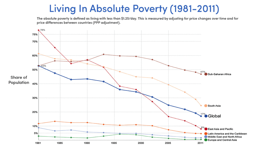
Declining rates of absolute poverty (Source: Our World in Data, Max Roser)
Absolute poverty is defined as living on less than $1.25/day. Over the last 30 years, the share of the global population living in absolute poverty has declined from 53% to under 17%.
While there is still room for improvement (especially in sub-Saharan Africa and South Asia), the quality of life in every region above has been steadily improving and will continue to do so. Over the next 20 years, we have the ability to extinguish absolute poverty on Earth.
2. Child Labor Is on the Decline (2000-2020)
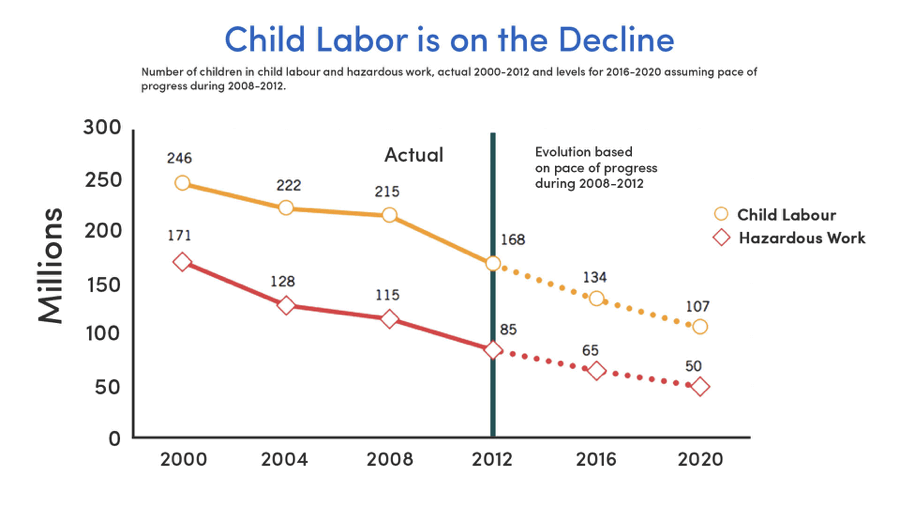
This chart depicts the actual and projected changes in the number of children (in millions) in hazardous work conditions and performing child labor between 2000 and 2020.
As you can see, in the last 16 years, the number of children in these conditions has been reduced by more than 50%. As we head to a world of low-cost robotics, where such machines can operate far faster, far cheaper and around the clock, the basic rationale for child labor will completely disappear, and it will drop to zero.
3. Income Spent on Food
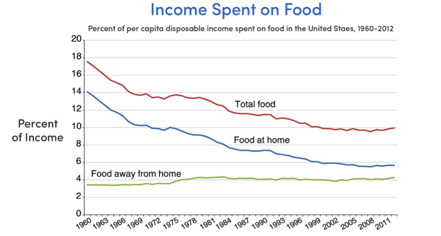
This chart shows the percent per capita of disposable income spent on food in the U.S. from 1960 to 2012.
If you focus on the blue line, ‘Food at home,’ you can see that over the last 50 years, the percent of our disposable income spent on food has dropped by more than 50 percent, from 14% to less than 6%.
This is largely a function of better food production technology, distribution processes and policies that have reduced the cost of food. We’re demonetizing food rapidly.
4. Infant Mortality Rates
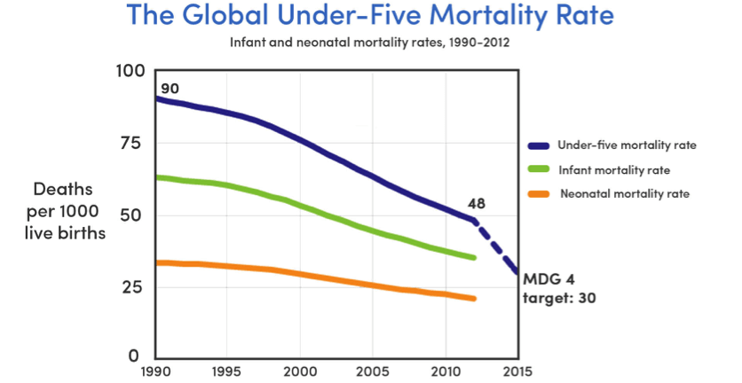
This chart depicts global under-five-years-old mortality rates between 1990 and 2012 based on the number of deaths per 1,000 live births.
In the last 25 years, under-five mortality rates have dropped by 50%. Infant mortality rates and neonatal mortality rates have also dropped significantly.
And this is just in the last 25 years. If you looked at the last 100 years, which I talk about in Abundance, the improvements have been staggering.
5. Annual Cases of Guinea Worm
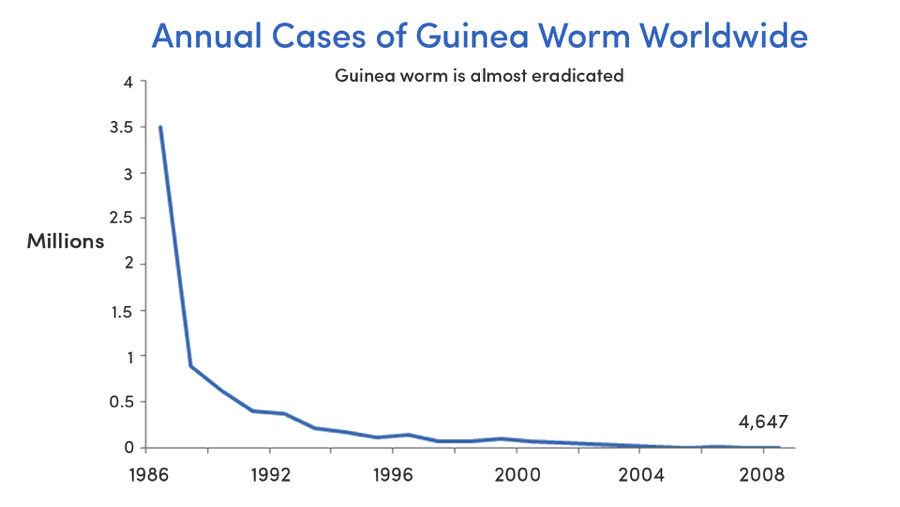
Guinea worm is a nasty parasite that used to affect over 3.5 million people only 30 years ago. Today, thanks to advances in medical technologies, research and therapeutics, the parasite has almost been eradicated. In 2008, there were just 4,647 cases.
I’m sharing the chart above because it represents humanity’s growing ability to address and cure diseases that have plagued us for ages. Expect that through technologies such as gene drive/CRISPR-Cas9 and other genomic technologies, we will rapidly begin to eliminate dozens or hundreds of similar plagues.
6. Teen Birth Rates in the United States
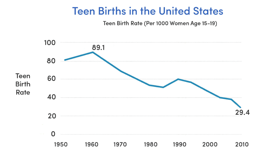
The chart above shows the dramatic decline in the number of teen (15 to 19 years old) birth rates in the United States since 1950. At its peak, 89.1 out of 1,000 teenage women were giving birth. Today, it’s dropped under 29 out of 1,000.
This is largely a function of the population becoming better educated, the cost of birth control being reduced and becoming more widely available, and cultural shifts in the United States.
7. Homicide Rates in Western Europe
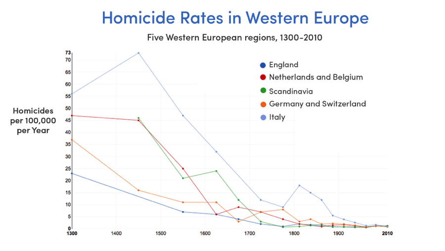
The chart above shows the number of homicides per 100,000 people per year in five Western European regions from 1300 to 2010.
As you can see, Western Europe used to be a very dangerous place to live. Over the last 700+ years, the number of homicides per 100,000 people has decreased to almost zero.
It is important to look back this far (700 years) because we humans lose perspective and tend to romanticize the past, but forget how violent life truly was in, say, the Middle Ages, or even just a couple of hundred years ago.
We have made dramatic and positive changes. On an evolutionary time scale, 700 years is NOTHING, and our progress as a species is impressive.
8. U.S. Violent Crime Rates, 1973 – 2010
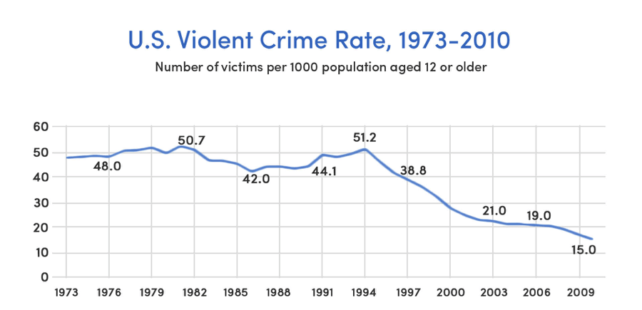
In light of the recent terrorist shooting in Orlando, and the school shootings in years past, it is sometimes easy to lose perspective.
The truth is, in aggregate, we’ve made significant progress in reducing violent crimes in the United States in the last 50 years.
As recent as the early 80s and mid-90s, there were over 50 violent crime victims per 1,000 individuals. Recently, this number has dropped threefold to 15 victims per 1,000 people.
We continue to make our country (and the world) a safer place to live.
9. Average Years of Education, 1820-2003
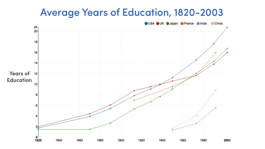
I love this chart. In the last 200 years, the average number of ‘years of education’ received by people worldwide has increased dramatically.
In the U.S. in 1820, the average person received less than 2 years of education. These days, it’s closer to 21 years of education, a 10X improvement.
We are rapidly continuing the demonetization, dematerialization and democratization of education. Today, I’m very proud of the $15 million Global Learning XPRIZE as a major step in that direction.
Within the next 20 years, the best possible education on Earth will be delivered by AI for free — and the quality will be the same for the son or daughter of a billionaire as it is for the son or daughter of the poorest parents on the planet.
10. Global Literacy Rates
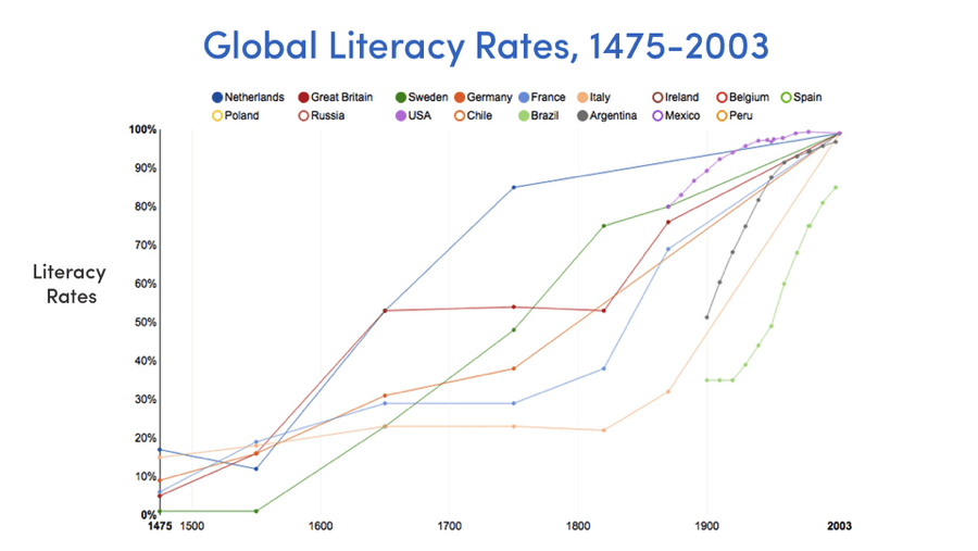
Along those same lines, the extraordinary chart above shows how global literacy rates have increased from around 10% to close to 100% in the last 500 years.
This is both a function of technology democratizing access to education, as well as abundance giving us the freedom of time to learn.
Education and literacy is a core to my abundance thesis — a better-educated world raises all tides.
We live in the most exciting time to be alive! Enjoy it.
Comment Section