How to Film Thought: A Close Look at the Masterful Editing of Sherlock.
Posted on 14 June 2018 in Non classé | 0 Comments
Louis C.K. 2016
Posted on 7 June 2018 in Non classé | 0 Comments
The Directors Series- Stanley Kubrick.
Posted on 7 June 2018 in Art | 0 Comments
Pale blue dot
Posted on 22 August 2017 in Non classé | 0 Comments
Where do ideas come from ?
Posted on 24 July 2017 in Editorial | 0 Comments
Young Advice from Master Filmmakers
Posted on 29 March 2017 in Movies | 0 Comments
Est-ce que la république de Platon a prédit l’arrivé du phénomène Trump? Voici une vidéo inquiétante qui nous y fait réfléchir.
Posted on 8 February 2017 in Politique | 0 Comments
L’art du silence au cinéma. Martin Scorsese.
Posted on 3 February 2017 in Movies | 0 Comments
10 diagrammes qui montrent que le monde est mieux que l’on croit.
Posted on 9 January 2017 in Politique | 0 Comments
Voici 10 diagrammes qui illustrent les récents avancements de l’humanité. Il y a de l’espoir, même si on pourrait facilement reculer. (Tiré de l’article de Peter Diamantris ; https://singularityhub.com/2016/06/27/why-the-world-is-better-than-you-think-in-10-powerful-charts/)
1. Living in Absolute Poverty (1981-2011)
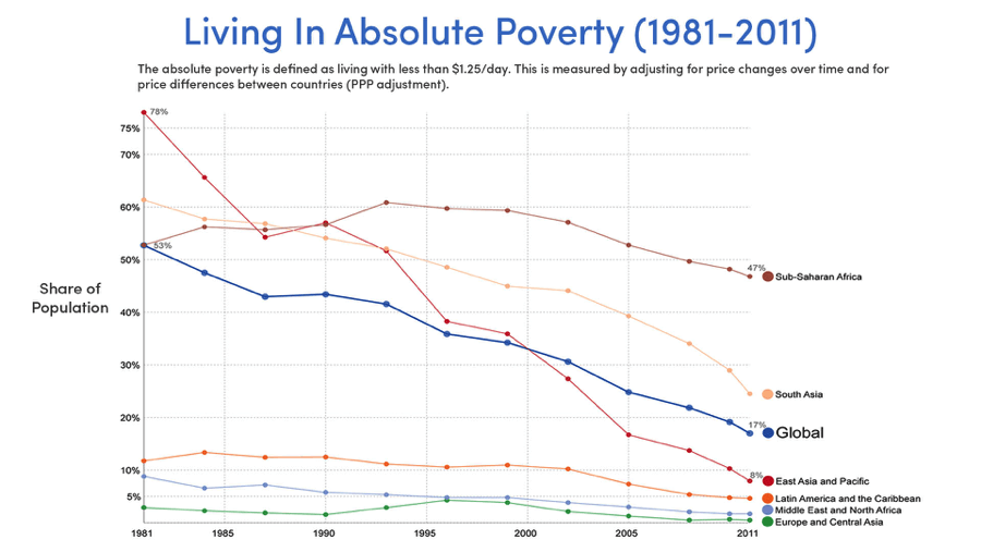
Declining rates of absolute poverty (Source: Our World in Data, Max Roser)
Absolute poverty is defined as living on less than $1.25/day. Over the last 30 years, the share of the global population living in absolute poverty has declined from 53% to under 17%.
While there is still room for improvement (especially in sub-Saharan Africa and South Asia), the quality of life in every region above has been steadily improving and will continue to do so. Over the next 20 years, we have the ability to extinguish absolute poverty on Earth.